Cleaning house and sprucing up the place
Its been a few weeks of working in the evenings but its pretty much done. I’ve been wanting to do this redesign for a while now. 2 years ago when I built the version of this domain you’ve all come to know, I attempted to create a design that was different from other programming blogs, and fused my interests in both design and programming. I feel it turned out well. There was an ever growing list of things that bothered me about it though.
- The small serif font was kind of hard to read.
- The noisy background made reading harder.
- The logotype ‘Mark Story Illustration’ was not even in the least bit relevant to the majority of the content
- The navigation links didn’t look clickable.
The list was a bit longer, but I’ll spare you the details. Since I completed the last design, and starting this one one, many other things have changed. HTML5 and CSS3 have gained significant traction and it makes sense to use them when possible.
The design process
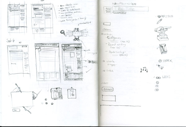
My design process always starts out on paper in my sketchbook. Usually I start with a list of things that need to be improved and a list of goals. After my lists are complete I start by making hand-written notes and scribbly sketches of my thoughts. For this design there were around 12 pages of notes, sketches and drawings, which is a bit above the average as this design involved many drawn elements. One of the first pages in my sketchbook for this design looks like the following.
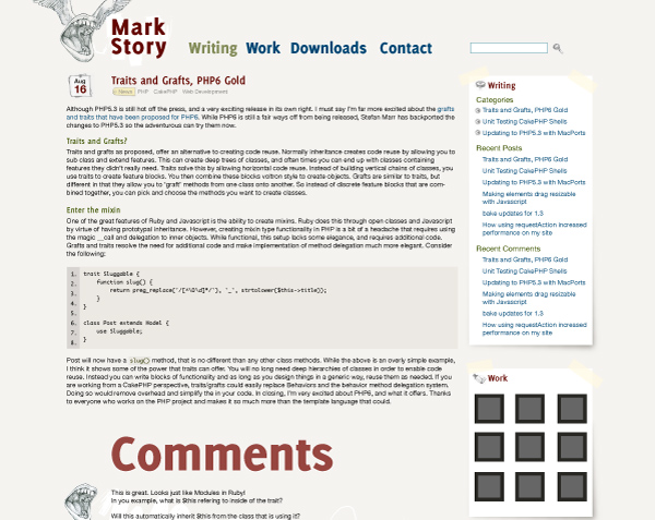
Once I have a drawing I’m happy with, I start layouts in illustrator. I find that Illustrator is a far better tool than Photoshop for working with type. Photoshop’s type tools are clunky, annoying and generally terrible compared to those in Illustrator. My ‘final’ illustrator design ended up looking like this.
With the layout and main graphic elements planned, I start prototyping in the browser with HTML. If I was working for a client there would be another step where I finalize all the designs in photoshop and get approval. Since I had no client to show pixel perfect designs this time, I went directly to iterating design ideas in my sketchbook, Photoshop and the browser. This process continues until I’m happy with the design.
Implementation time
One of my goals for this design, was that I wanted to use some features that have come out since the last design. With the advent of reliable at font-face I decided to use the wonderful Delicious typeface for the titles and navigation. A few CSS3 features like box-shadow, text-shadow, border-radius and rgba colours were used to spice things up. I attempted to use border-image on the comment boxes. However, an interesting interaction between transparent border images and background colours forced me to eventually cut it.
Since HTML5 was gaining steam fast, I decided to jump on the bandwagon too. I wanted to go beyond simply switching the doctype. I wanted to use HTML5 elements where they made sense, and the implementation seemed mostly complete. Getting Internet Explorer to play nicely with the HTML5 elements was easy with Remy Sharp’s HTML5 shim. But what about IE6? Well IE6 comprises a miniscule portion of my traffic, and dropping IE6 was on my list. No IE6 support meant I could clean a pile of cruft out of the CSS files and remove some extra class attributes as well. If you happen to be an IE6 user, I’m sorry.
While everything thing isn’t 100% complete, and there are still a few tweaks and optimizations to be done, I’m happy with it. I hope you enjoy it as well.
Interesting read. I really enjoy reading about peoples overall design process.
I think you’ve produced a very sexy looking website. Nice work :-)
Graham Weldon on 2/1/10
well done mark. now my two favorite marks (you and pilgrim) have snazzy html5 blogs. :)
Joshua McNeese on 2/2/10
Looking good, now I must do it!
Although, the comments text is too large, haha.
Miles Johnson on 2/2/10
The re-design looks really nice. I am also glad to find someone other than me who prefers Illustrator when working on web designs.
Martin Westin on 2/2/10
Just when I gave up and made myself my own userstyle to make your site readable (http://userstyles.org/styles/24654), you go ahead and make it readable yourself.
You’ve done a great job keeping it simple and close to the source! Now I can finally read your blog without squinting my eyes to death. :)
One suggestion: Add a separator between the tags of an article. A dash will work well, in my opinion.
Ben Pesso on 2/2/10
Very nice. The design is much better then the last one, and dropping IE6 is something probably everyone is going to do this year.
I do like Photoshop better, but I guess Illustrator is better for, well you know, illustrating :-)
Ivan on 2/2/10
Always a good read. I wish I had a better eye for design. I’m happier behind the scenes making the wires fit together, but I truly appreciate the hard work and creativity that goes into making that web app look pretty.
Nice work.
Nick on 2/2/10
Really excellent work, Mark. I like how you’ve combined your hand-crafted look-&-feel with a very sparse design. I particularly like the typeface and styling you chose for the titling.
Nate Abele on 2/2/10
Thanks everyone :)
Ivan: I just find that doing things like changing typefaces in photoshop can be brutally time consuming when compared to illustrator. I still find photoshop is way better at making pixel perfect images. I’ve heard great things about Fireworks, but just haven’t had the time to investigate it.
Miles: Originally it was bigger, and there was much more huge type, but I cut it back. I find the huge type provides good visual separation, shows off the nice type face and is a title :)
mark story on 2/2/10
Thanks for cleaning the site. Nice color and buttons!
Now I’d rather read your posts here than google reader.
Jedt on 2/16/10